simple tweaks to turn browsers into buyers.
In the vast digital marketplace, attracting visitors to your website is only half the battle. The real challenge, and often the most frustrating, lies in converting those casual browsers into committed buyers. Many businesses invest heavily in driving traffic, only to see potential customers arrive, browse, and then vanish without making a purchase. This article delves into practical, actionable strategies – simple tweaks, if you will – designed to bridge that gap, helping you turn browsers into buyers and significantly increase website conversion rate. We’ll explore common pitfalls, reveal proven techniques, and offer quick wins to optimize your website for sales, ensuring your efforts translate into tangible revenue.
Why Visitors Leave Without Buying
It’s a familiar scenario for any online business: your analytics show a healthy stream of visitors, but your sales figures tell a different story. High bounce rates and abandoned carts aren’t just statistics; they represent lost opportunities and potential revenue walking out the digital door. Understanding why visitors leave without buying is the crucial first step in devising effective strategies to convert website visitors into paying customers. Often, the reasons are less about your product’s inherent value and more about the experience you’re providing.
One primary culprit is a lack of clarity. If a visitor lands on your page and can’t immediately understand what you offer, who it’s for, or what problem it solves, they’re likely to hit the back button. Ambiguous headlines, jargon-filled descriptions, or a cluttered layout can quickly overwhelm and confuse. Similarly, a slow-loading website is a death knell for conversions. In today’s fast-paced digital world, users expect instant gratification. Even a few extra seconds of loading time can lead to a significant drop-off, as patience wears thin and competitors are just a click away.
Beyond clarity and speed, trust plays an enormous role. Online shoppers are inherently cautious. They’re wary of scams, poor product quality, and unreliable service. If your website lacks signals of trustworthiness – such as security badges, clear contact information, customer reviews, or a transparent return policy – visitors will hesitate to commit. Hidden costs, like unexpected shipping fees revealed late in the checkout process, are also notorious for causing abandonment. People dislike surprises when it comes to their money. Addressing these fundamental issues is paramount to creating an environment where visitors feel comfortable and confident enough to become buyers.
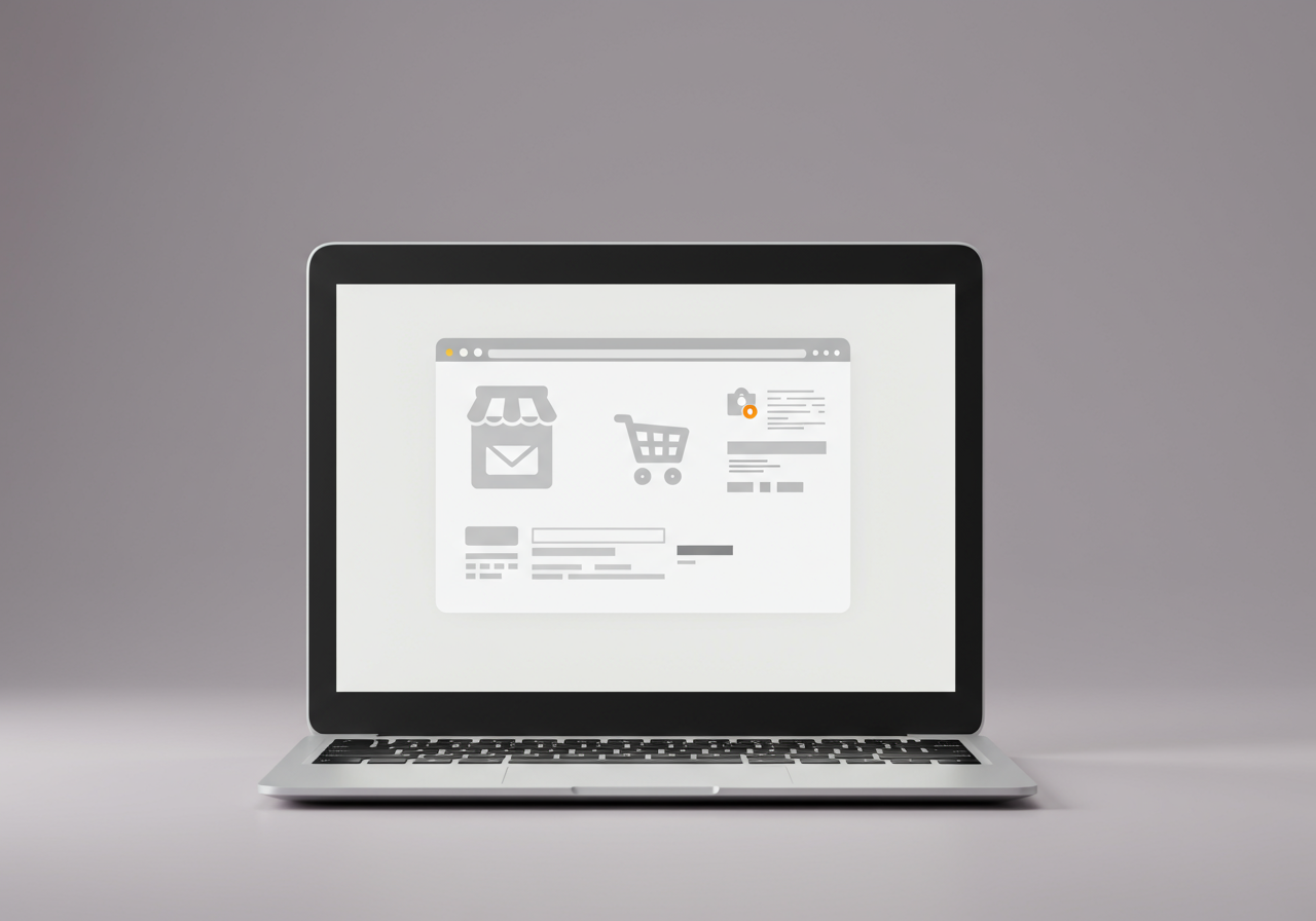
Make Your ‘Shop Window’ Shine
Your website is your digital storefront, your 24/7 sales representative, and often the first impression a potential customer has of your brand. Just as a physical shop needs an inviting display to draw people in, your online presence must be meticulously crafted to captivate and guide visitors. To truly turn browsers into buyers, you need to make your ‘shop window’ shine, ensuring that your website’s design and user experience (UX) are top-notch and immediately convey value and professionalism.
The visual appeal of your site is non-negotiable. High-quality product images and videos are paramount. Don’t just show one angle; provide multiple views, lifestyle shots, and even 360-degree spins. For services, use engaging graphics, clear infographics, and professional imagery that reflects your brand’s essence. Poor quality visuals are a major deterrent and can instantly undermine perceived product value. Beyond aesthetics, your website’s navigation must be intuitive and effortless. Visitors should be able to find what they’re looking for within a few clicks, without feeling lost or frustrated. Use clear categories, a prominent search bar, and logical pathways.
Furthermore, mobile responsiveness is no longer optional; it’s essential. A significant portion of online traffic comes from mobile devices, and if your website isn’t optimized for smaller screens, you’re alienating a massive segment of your potential customer base. Ensure your site loads quickly on mobile, is easy to navigate with a thumb, and all interactive elements are touch-friendly. Finally, present your unique selling proposition (USP) clearly and prominently, ideally above the fold. What makes you different? Why should they buy from you? Answering these questions immediately helps visitors understand your value and encourages them to explore further, setting the stage for you to convert website visitors into paying customers.
Clear Calls to Action (Seriously!)
Imagine walking into a store, finding something you love, but then realizing there’s no clear counter, no price tag, and no one to tell you how to buy it. Frustrating, right? The same principle applies to your website. Without clear, compelling, and strategically placed Calls to Action (CTAs), your visitors might admire your products or services but remain unsure of the next step. To effectively turn browsers into buyers, you need to guide them explicitly, almost holding their hand through the purchase journey.
A powerful CTA is more than just a button; it’s an instruction that prompts a desired action. It should be visually distinct, using contrasting colors that stand out against your website’s background. Its placement is equally critical – it needs to be easily found, often above the fold, near product descriptions, or at the end of a compelling piece of content. But beyond visibility, the wording of your CTA is paramount. Instead of generic phrases like «»Click Here,»» opt for action-oriented, benefit-driven language such as «»Add to Cart,»» «»Shop Now,»» «»Get Your Free Quote,»» «»Download the Ebook,»» or «»Start Your Free Trial.»» These phrases not only tell the user what to do but also hint at the value they’ll receive.
Consider the user’s journey and place CTAs logically at each stage. For example, a product page needs an «»Add to Cart»» button, while a blog post might feature a «»Learn More»» or «»Subscribe»» CTA. Don’t overwhelm users with too many options on a single page, but ensure that the most important action is undeniably clear. A/B testing different CTA texts, colors, and placements can reveal what resonates most with your audience, allowing you to continually optimize website for sales and ensure that every visitor knows exactly how to progress from browsing to buying.
Build Trust, Fast (Proof is Key)
In the anonymous expanse of the internet, trust is the invisible currency that underpins every transaction. Without it, even the most appealing products or services will struggle to turn browsers into buyers. Online shoppers are naturally cautious, and their hesitation can be a significant barrier to conversion. Your mission, then, is to build trust quickly and conspicuously, providing ample evidence that your business is legitimate, reliable, and delivers on its promises.
One of the most powerful forms of trust-building is social proof. People are influenced by the actions and opinions of others. This is why customer reviews and testimonials are gold. Integrate a system for collecting and displaying genuine reviews directly on your product pages. Showcase star ratings prominently and encourage detailed written feedback. User-generated content, such as photos or videos of customers using your products, can be incredibly persuasive. If you have a significant social media following or have been featured in reputable media, highlight these achievements. These signals tell potential buyers that others have had positive experiences with your brand, making them more comfortable taking the plunge.
Beyond social proof, transparency and security are critical. Displaying security badges (like SSL certificates) visibly assures customers that their personal and payment information is protected. Clearly state your return policy, refund guarantees, and shipping information. A generous and transparent return policy can significantly reduce purchase anxiety. An «»About Us»» page that tells your brand’s story, introduces your team, and outlines your values can humanize your business and foster a connection. Finally, make your contact information easily accessible. A visible phone number, email address, and live chat option signal that you’re available to assist and resolve any issues, further solidifying the trust required to convert website visitors into paying customers.
Simplify the Checkout (No Friction!)
You’ve done the hard work: attracted visitors, showcased your products, built trust, and guided them with clear CTAs. Now, they’re at the finish line – the checkout process. This is the most critical stage, where even the slightest friction can cause an otherwise eager buyer to abandon their cart. To truly turn browsers into buyers, you must make the checkout experience as smooth, swift, and utterly frictionless as possible. Think of it as the final, delicate push that seals the deal.
One of the biggest culprits for abandoned carts is a complicated or lengthy checkout. Avoid mandatory account creation. While useful for repeat customers, forcing first-time buyers to register before purchasing adds an unnecessary hurdle. Offer a guest checkout option, allowing them to complete their purchase quickly and simply. If they have a positive experience, they’ll be more likely to create an account voluntarily later. Furthermore, streamline the number of steps in your checkout process. Each page, each field, is a potential point of friction. Use progress indicators («»Step 1 of 3″») to manage expectations and reassure customers they’re nearing completion.
Transparency regarding costs is also vital. Surprise shipping costs are a notorious reason for abandonment. Display shipping options and their associated costs early in the process, ideally before the final confirmation page. Offer multiple secure payment options, including popular credit cards, PayPal, Apple Pay, or Google Pay, to cater to diverse preferences. Clearly display security badges during checkout to reinforce trust. Finally, ensure all form fields are intuitive, with clear labels and helpful error messages that guide users to correct mistakes without frustration. By meticulously removing every possible obstacle, you create a seamless path that makes it incredibly easy for visitors to convert website visitors into paying customers.
Quick Wins You Can Try Today
While some website optimizations require extensive overhauls, many effective strategies to turn browsers into buyers can be implemented quickly, offering immediate improvements to your conversion rates. These «»quick wins»» are often low-effort, high-impact tweaks that can start yielding results today, providing valuable insights and a tangible boost to your bottom line. They are excellent starting points for any business looking to increase website conversion rate without a complete redesign.
One of the most effective quick wins is implementing exit-intent pop-ups. These intelligent pop-ups detect when a visitor is about to leave your site and present them with a last-chance offer, such as a discount code, a free shipping offer, or an invitation to sign up for your newsletter in exchange for a future discount. This can capture a significant percentage of otherwise lost traffic. Similarly, consider adding a live chat widget to your website. This provides instant support for visitors who have questions or encounter issues, directly addressing potential points of friction in real-time. Often, a quick answer can be the difference between a sale and an abandonment.
Another powerful tactic is to leverage retargeting campaigns. While not strictly an on-site tweak, it’s a quick way to re-engage browsers who left without buying. By showing targeted ads to people who have visited specific pages on your site, you keep your brand top-of-mind and encourage them to return and complete their purchase. On-site, try A/B testing your headlines and CTAs. Even small changes in wording or color can have a measurable impact. For instance, test «»Shop Now»» versus «»Get Yours Today»» or a red button versus a green one. These micro-optimizations, while simple, are fundamental to ecommerce conversion strategies and can quickly reveal what truly resonates with your audience, making it easier to convert website visitors into customers.
What Actually Works (My Take)
Having explored various facets of converting browsers into buyers, it’s crucial to synthesize these insights into a cohesive strategy, particularly focusing on what truly delivers results in the long run. There’s no single magic bullet, but rather a combination of continuous effort, data-driven decisions, and a relentless focus on the customer experience. My take on «»what actually works»» boils down to a holistic approach that prioritizes understanding, empathy, and persistent optimization. This is how you truly increase website conversion rate.
Firstly, it’s all about understanding your audience deeply. Generic approaches rarely work optimally. Who are your ideal customers? What are their pain points, desires, and browsing habits? Leverage analytics tools (like Google Analytics, heatmaps, and user session recordings) to observe how visitors interact with your site. Are they getting stuck? Where are they spending their time? This qualitative and quantitative data is invaluable for identifying specific areas for improvement, helping you tailor your website to their specific needs and making it easier to turn browsers into buyers.
Secondly, the power of continuous A/B testing cannot be overstated. Don’t assume; test. Every element, from your product descriptions and images to your checkout flow and CTA buttons, can be optimized. Small, iterative changes, rigorously tested, accumulate over time to produce significant gains. This scientific approach ensures that every tweak you make is backed by data, rather than guesswork, making your website conversion tips truly effective. Finally, prioritize building genuine relationships and trust. In an increasingly crowded digital landscape, authenticity stands out. Be transparent, responsive, and provide exceptional customer service. When customers feel valued and secure, they are far more likely to make a purchase and, crucially, to return for more, solidifying your efforts to convert website visitors into paying customers.
Converting browsers into buyers isn’t a one-time fix; it’s an ongoing journey of refinement and adaptation. By implementing these simple, yet powerful, tweaks, you can transform your website from a mere display window into a highly effective sales engine. From optimizing your ‘shop window’ and clarifying your calls to action to building undeniable trust and simplifying the checkout process, each step contributes to a more seamless and persuasive customer journey. Remember, even small changes can yield significant results when consistently applied and tested. So, start today, analyze your results, and watch as those casual visitors transform into loyal, paying customers, driving the growth and success of your online business.